 Add Row
  Add
Add 


Find Your Perfect Shade: Butter Yellow's Unique Charm
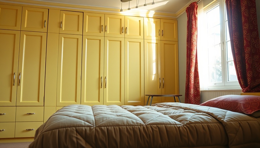
Butter yellow may seem like a simple color, but its impact on a home can be transformative. This specific shade navigates the fine line between vibrancy and subtlety, making it a favorite among architects and designers for creating a harmonious atmosphere. It's no wonder that several industry professionals have shared their top picks in this sunny hue, each bringing unique benefits to their chosen spaces.
Architects Share Their Personal Favorites
San Francisco designer Lauren Geremia embraces the brightness of Farrow & Ball’s Pale House No. 71, which she describes as a "luminous butter yellow" suitable for a Tudor-style home. Its gentle essence softens bold architectural features, enhancing the feel of double-height rooms.
Meanwhile, in a New York nursery, Alexandra Loew opted for Donald Kaufman DCK-42, likening it to "morning’s first light." This tranquil, buttery tone is perfect for gender-neutral spaces, encouraging calmness and warmth.
Elevate Spaces with Designer Choices
On the warmth spectrum, Hawaiian designer Roberto Sosa turned to Benjamin Moore’s Pale Moon for bedroom floors, merging classic design with a Mediterranean flair. This shade not only grounds the room with its rich yet soft tone but also brightens the space with its reflective quality.
For those seeking a bolder take on butter yellow, Marion Philpotts-Miller at Philpotts Interiors suggests PPG Spiced Butternut. This vibrant accent option brings light to even the dimmest rooms, suggesting how strategic color choices can expand small spaces visually.
Making Butter Yellow Your Own
One engaging element of using butter yellow is its versatility. Amalia Skoufoglou from O’Sullivan Skoufoglou Architects recommends Little Greene’s Oak Apple 63, a subtly grounded butter yellow that harmonizes beautifully with other colors, enhancing the personality of any room, just like its application in a colorful London Victorian terrace. The hint of green can evoke a sense of nature inside your home.
Another standout choice is Jayne Michaels' pick, Benjamin Moore Mellowed Ivory 2149-50. This muted shade, infused with hints of green and beige, adapts neatly to various interior design themes, resonating with contemporary tastes as seen in her Kips Bay project.
Tips for Incorporating Butter Yellow in Your Home
If you're contemplating a touch of butter yellow in your home, there's more to it than just a fresh coat of paint. Here's how to seamlessly integrate it into your space:
- Accent Walls: Consider painting one wall in a room to create a focal point without overwhelming the space.
- Mix with Neutrals: Combine butter yellow with beige, white, or soft gray for a balanced, serene vibe.
- Pair with Bold Colors: For more adventurous spirits, accentuate butter yellow with deep blues or forest greens to create stunning contrasts.
Why Choose Butter Yellow?
Ultimately, choosing butter yellow is not just about aesthetics. This color can evoke feelings of warmth, optimism, and creativity, enhancing the atmosphere of your home. Whether you're enveloping your living space in subtle brightness or aiming for bold accents, the options are plentiful and exciting.
As you consider a fresh look for your living spaces, think about the impact of color on mood and design. Butter yellow is not merely a preference; it symbolizes sunshine and positivity, and investing in its shades could uplift your entire living experience.
Ready for a makeover? Explore the versatile options that butter yellow has to offer and brighten up your favorite spaces today!


Write A Comment